Is Your Website Designed Properly?
A good or bad website is generally determined by 3 main factors: Design, Usability, and Search Engine Friendliness. All three of these factors must be done correctly in order for your website to attract and retain visitors, and to rank with search engines.
This article focuses on the design and usability of your website.
How Do You Know if Your Website is Designed Properly?
Look at your website. Have your friends and family take a look as well, ideally using different browsers (Chrome, Firefox, Safari) and different devices (desktop, tablet, phone, etc.)
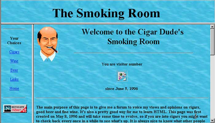
- Do the colors work together, or do they clash or are too bright? Is it hard to read the text against the background?
- Does the design make sense for your type of business (for instance, a pink color scheme and flowers may not work for a construction company, or a plain corporate looking website with a navy and grey color scheme wouldn't work for a children's nursery school).
- Does the background image contain a lot of clutter or elements that hurt your eyes or make it difficult to view the website's content?
- Is the type/font very small, or in a script or cursive style, that makes it hard to read? Tiny type can mean that the website is VERY outdated, which means there are probably other age-related issues as well.
- Is your phone number prominently displayed at the top of every page of the website, and is it easy to read?
- Is the navigation menu prominently displayed at the top of every page of the website, and is it easy to read and select links? There are some designs in which the menu is on the left side of the page, but most people expect the menu to be at the top of the page, and a menu on the side doesn't work well on phones and other small devices.
- Is the content organized, or are there blocks of text and images placed haphazardly throughout the page?
- Are there so many attention-grabbing elements on the page (animated gifs, moving text, pop-ups, multiple navigational menus, many different text styles and colors, etc.) that the user has trouble focusing on one particular element or figuring out what to click?
How Do You Know if Your Website is Usable?
Again, have your friends and family test the website in different browsers, screen resolutions, and devices. Elements that work in one browser may be broken in another browser.
- Can you quickly and easily find the information you're looking for in 3 or less clicks? Users want a "quick fix", and if they have to click all over your website to find what they want, they will move on.
- On a phone, do you have to pinch and zoom on the page to read the content? That means your website is not mobile-friendly. All websites should be mobile-friendly, and if yours is not, that means it's either quite old or the web designer didn't know how to make it mobile-friendly.
- Do all your links work? One broken link (a link that leads to an error or a non-existent page) can be enough to make the user leave the website.
- Is the text on the website correct in terms of spelling and grammar
If your website suffers from one or more of these design and usability flaws, it should be fixed. Sometimes these issues can simply be repaired if there are only a few of them. But if there are lot of design and usability issues, especially if the website is more than a few years old, it may be best to simply get a new one built.
©
T. Brooks Web Design, LLC.
All rights reserved.

Do not copy content from this page without attribution to T. Brooks Web Design and link back to this page.


