
Please call or text me to find out about my services.
| CALL or TEXT 609-914-1318 |
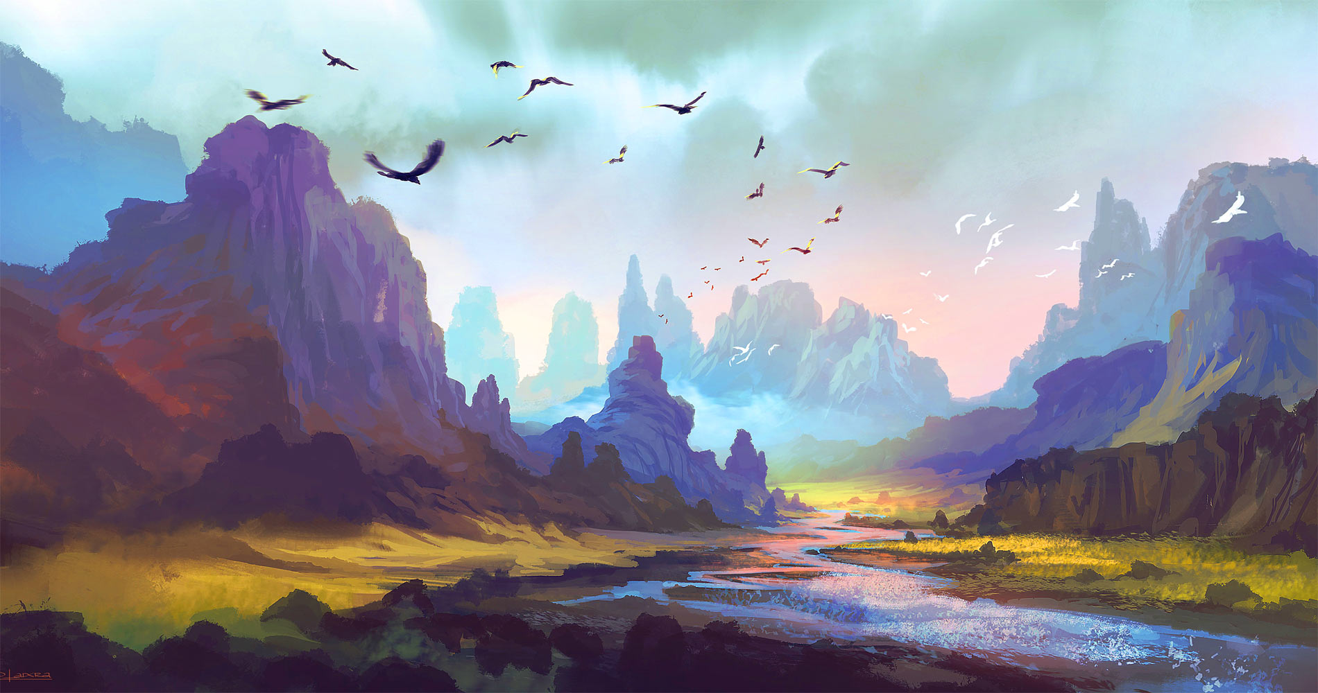
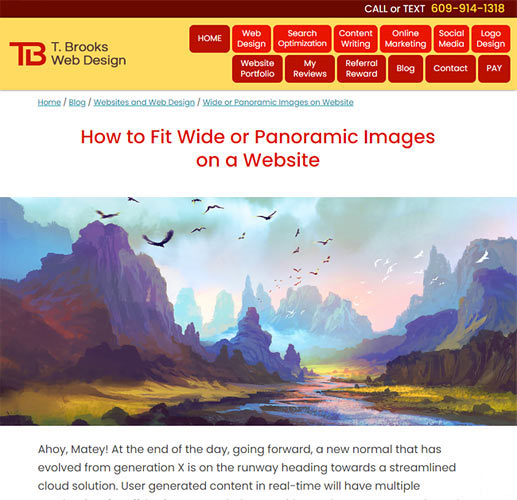
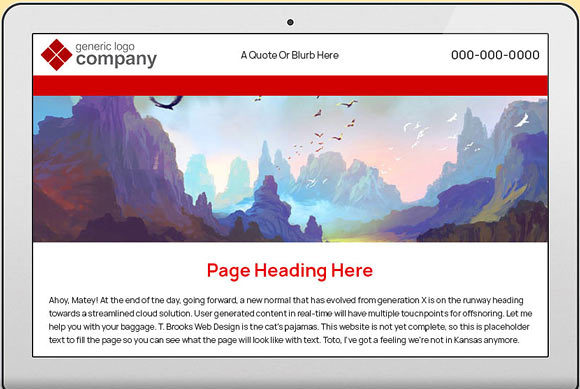
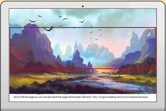
Finding images that are large and wide enough to stretch across even the widest browsers can be a challenge. Depending on the display width, dimensions and resolutions, parts of the image will be cut off. As the display gets wider, more of the top and bottom of the image get cropped. As the display gets more narrow, more of the left and right of the image get cropped. So if it's an image of a close-up shot, important parts of the image may get cut out, making these wide, panoramic images better suited for photos that are taken from farther away and don't have any text near the edges. And of course, the image to be used must be in landscape orientation (wider rather than tall) instead of portrait orientation (taller rather than wide).
Figuring out how to size and crop the image properly involves some math. There are websites that can help, but they can be confusing and complicated. Your best bet is to work with a web designer who knows how to properly optimize your images so you don't have to. If it's not done correctly, your website images could end up looking distorted, blurry or pixelated, as well as slow down the loading of your website (and website speed is a major Google search ranking factor).
The best way to see how display size affects the wide image at the top of this page is to adjust your browser's width. This is also a great way to see how a responsive website's formatting changes based on screen size.
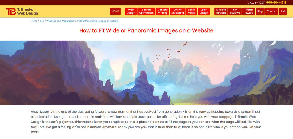
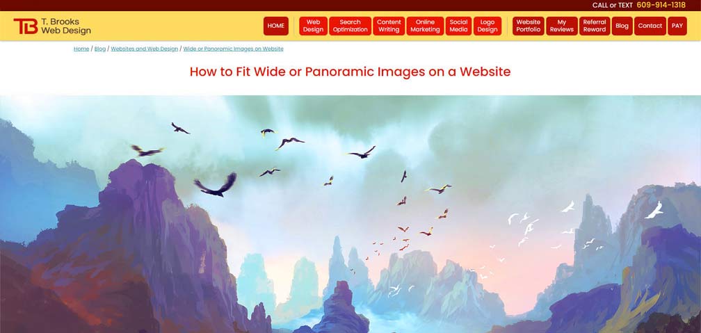
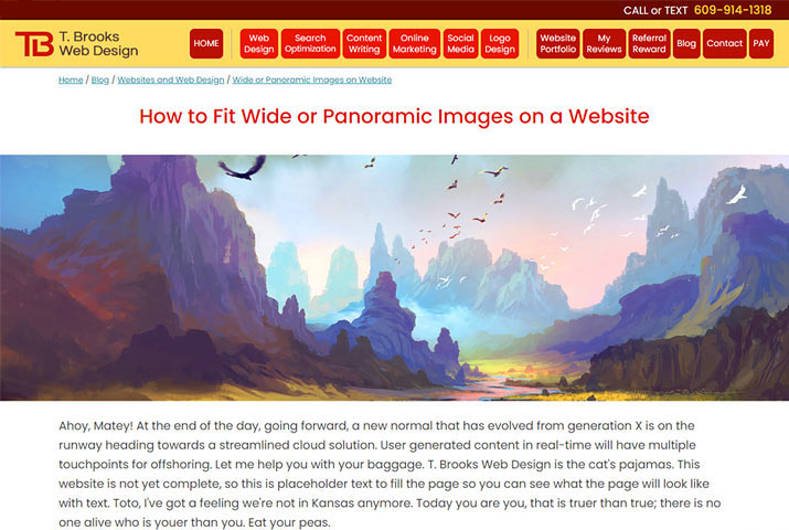
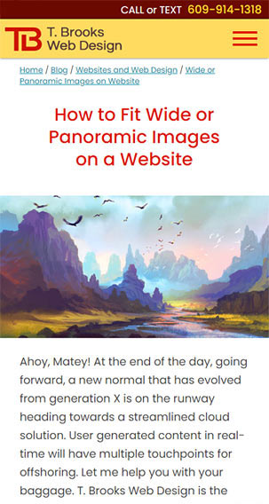 Once the display size is under 500 pixels wide, the 1900 x 1000 pixel image (with a file size of 247KB) gets swapped out for an identical 500 x 320 image (with a file size of 33KB) that loads more quickly.
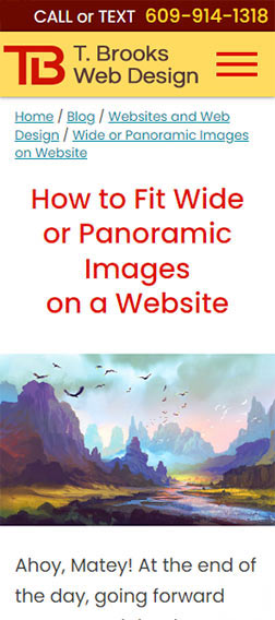 At the smallest mobile display (300px), you see the full top and bottom of image, but the sides are cropped.
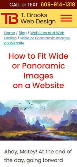 The image in the previous example, with the entire image fitting into the space, and no cropping. But the image looks too flat, because the image itself is very wide. It could be solved with a third swap if showing the cropped out elements on the left and right side were important.

|
CONTACT ME
|
HOURS 7 Days/Week
8:00am-6:00pm |
PAYMENTS
|
CONNECT
|
